
|
Hello everyone!
I have for you another Valentine’s Day card. Well, actually it can be given for other occasions, but I’m making it for this occasion. 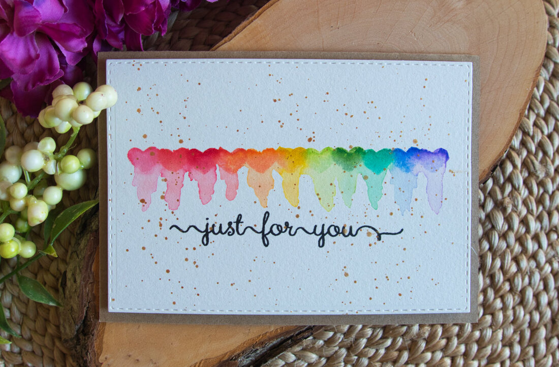
While this card is fairly easy to make, it’s not as simple as my previous cards, because you will need few specific supplies, like a stamp in the shape of heart and Distress inks.
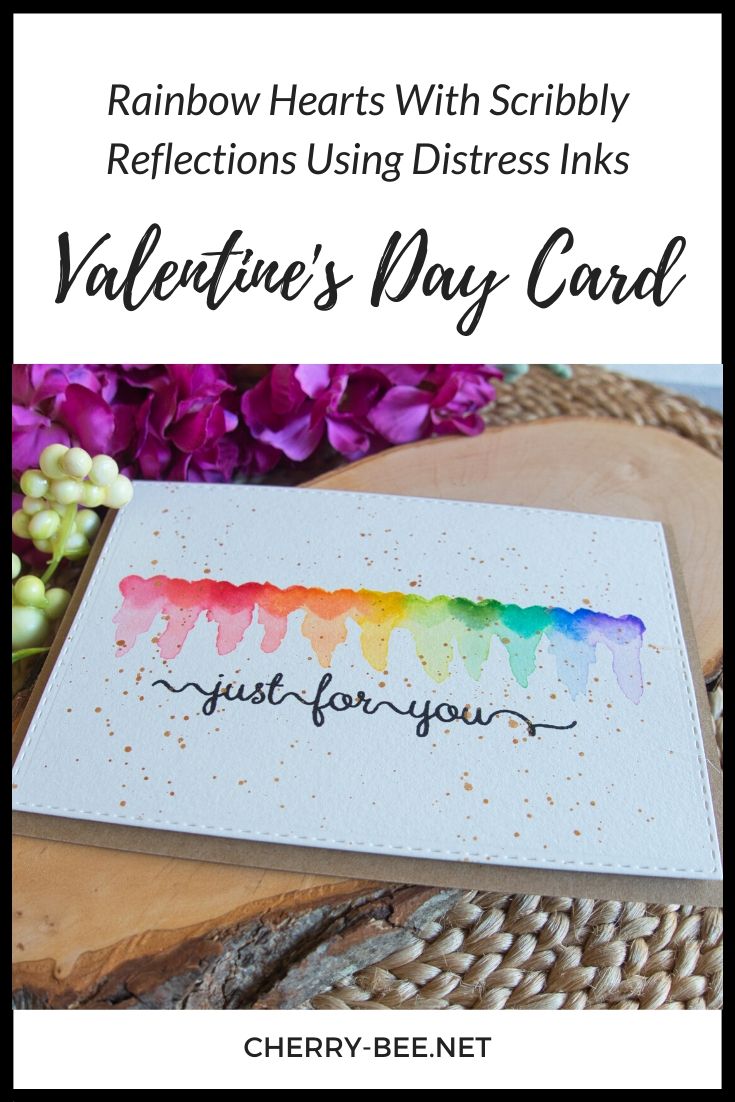
The inspiration for this card I got from Michelle Short, she made a card on her YouTube channel, where she stamped a city skyline using distress inks and then she created reflections. You can see the video here. If you don’t know what reflections are. When you have a city skyline or mountains and below it is a lake reflecting the city skyline or the mountains, that’s reflections. I was looking for this term so long, because I saw something similar on Instagram where someone painted pine trees and the bottom of the pine trees was bleeding down. No idea how to describe it. I don’t think these are called reflections, but it’s similar. You can see the Instagram video here. What I like about the card Michelle made is that she didn’t create true reflections, she called it scrubbily reflections, which I really liked and right away I thought, I have to create something like this. 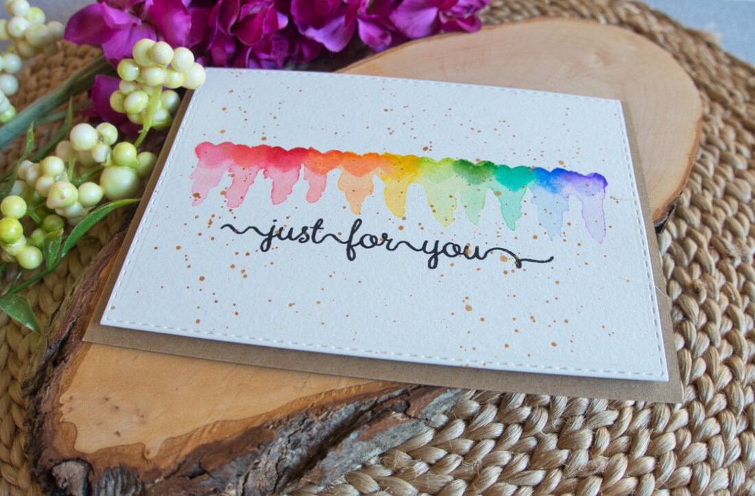
I’m not sure if the idea using hearts came after I watched Michelle’s video or later, when I was thinking what I can make for Valentine’s day, which doesn’t matter.
But let’s talk about how I made this card. As I said I’m using Distress inks, eleven different colours for eleven hearts. This is the amount of hearts that fits on a horizontal layout. In the video I think I mentioned twelve, but it’s eleven. Somehow I thought it was twelve. The stamp set I’m using for my card is from Wplus9 and it’s called Little Bits. These hearts are quite small, that’s why I needed eleven colours. And I do wish I had a stamp set with bigger hearts, but I didn’t find anything I would like. My trial card was vertical, but I thought there was too much white space I decided to do this card I’m sharing with you horizontally. To figure out how many hearts I need and which colours of Distress inks I like, I first stamped bunch of hearts on a scrap of card stock. 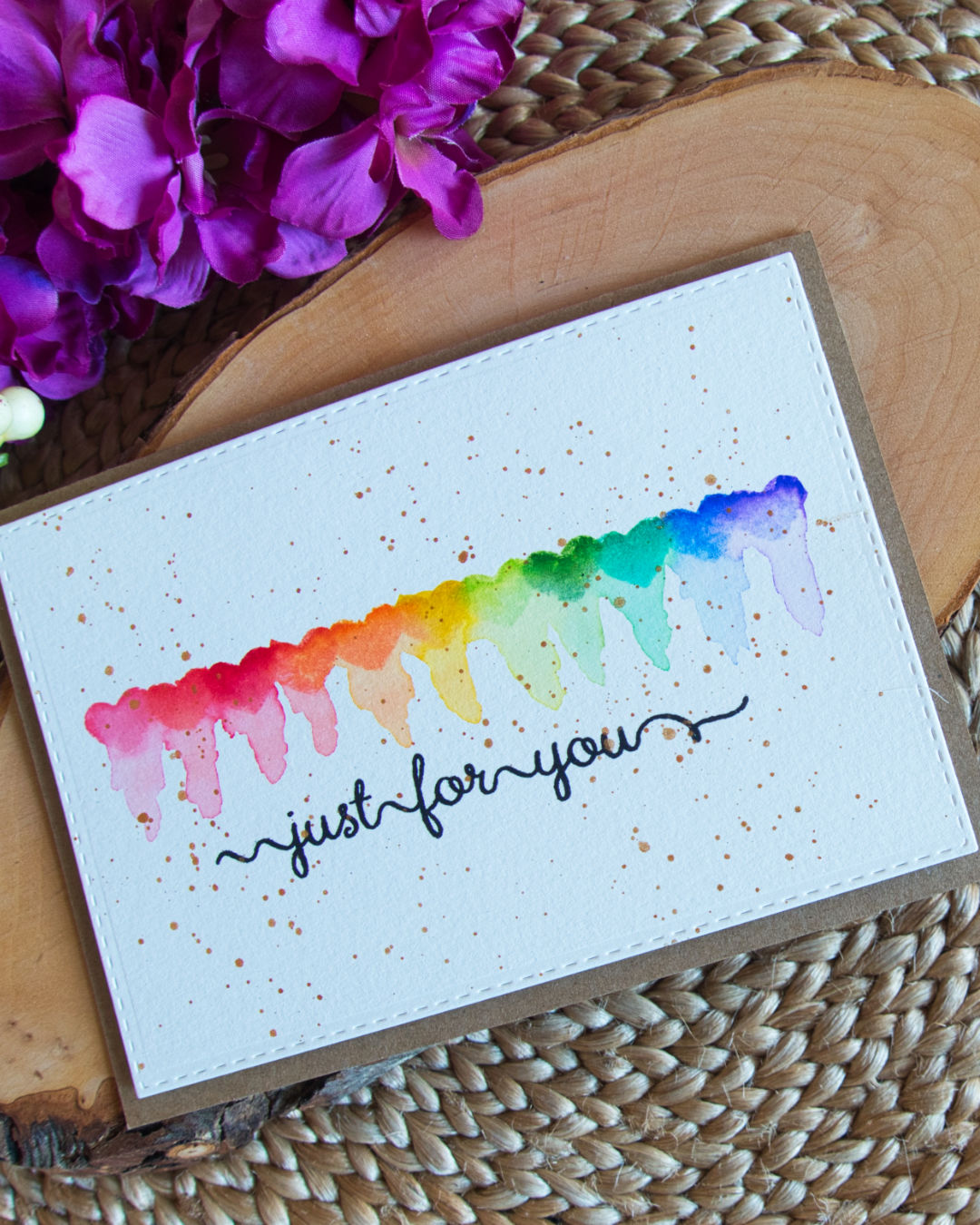
The Distress ink colours I picked are:
I trimmed down a panel to A6 size for which I used the Canson XL, cold press watercolour card stock. And then I drew a line to make sure that I’m stamping in a straight line. What I found important is to have an acrylic blog that has lines. This way it’s easier to align the line on the panel with the lines on the acrylic block. For my first card I didn’t use such acrylic block and the hearts weren’t in a straight line. I drew the line I thing five, six centimetres from the bottom, but I wish I put it about one centimetre higher to make sure that not only the hearts are in the middle but the whole thing - the hearts, reflections and the sentiment. I started stamping in the middle with yellow heart and then I went to the right and then to the right. I also made sure that the hearts are overlapping slightly. 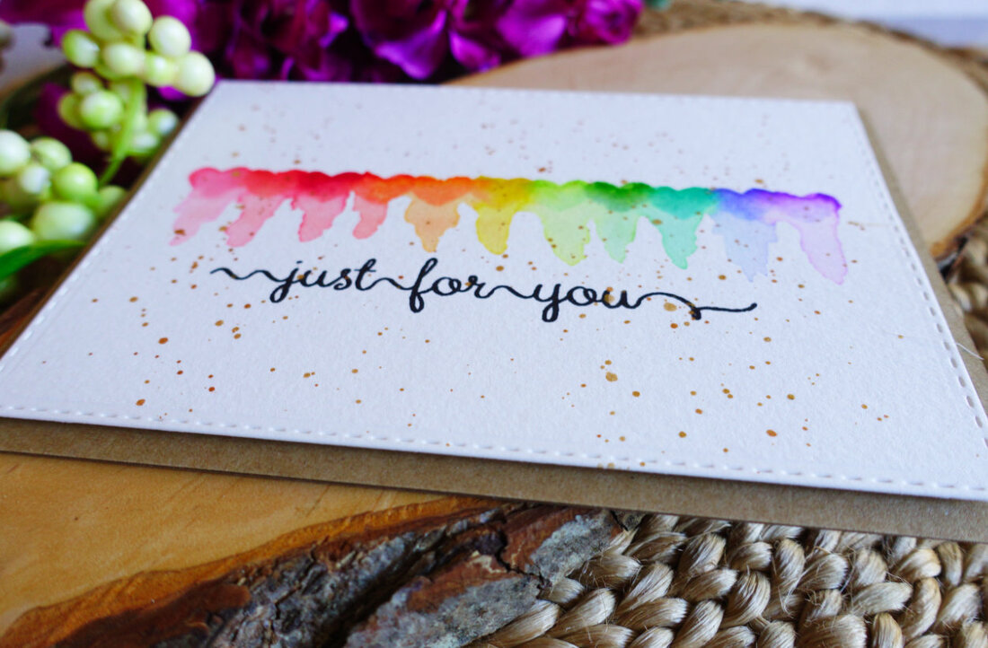
I dapped the heart in the Distress ink, stamped on the panel, then I wiped the stamp with a damp clothed and dried it on a piece of kitchen towel. And repeated the process on each eleven hearts.
Before I put the Distress inks away, I also squished them on a piece of acrylic glass that I bought recently. You don’t need an acrylic glass you need anything with a slick surface. I will be using the Distress inks on the acrylic glass, when I will be creating the reflections, to make the colours more saturated, if needed. Distress inks are water reactive, so I tried first if the colour from the heart is enough, and if it wasn’t I added the colour I had on the acrylic glass. After I stamped all eleven hearts I first erased the pencil line and then I started with the reflections. I dapped my watercolour brush in little bit of water and had also a kitchen towel next to me just in case I had too much water on my brush. Then I reactivated the colour of the heart and then moved the colour downwards. I found that tilting the card stock helped to get the water moving. At first I thought it looked horrible, but in the end I think it looks quite cool, not as cool as Michelle’s card. I think it also depends what kind of image you use. I think something with a flat end might work better and hearts have a pointy end. VIDEO TUTORIAL
Watch the video below or on my YouTube Channel.
I let the card air dry and then I used my stitched rectangular dies and die cut the panel.
For the sentiment I used a stamp set from Clearly Besotted and stamped it right below the reflections using the Versafine ink in Onyx black. Before I adhered it to a card base, I decided to use a golden splatter, for which I used the watercolours from Gansai Tambi. This is completely optional, I just thought the card needs something extra. You can use some embellishments or just leave it as it is. For the card base I used a craft cardstock and I adhered the panel on top of it using a foam tape. This finishes the card. I hope you liked it and got inspired. If you recreate this card or something similar, I would like to see it. If you have an instagram, you can tag me there. Thank you for stopping by, if you have any questions, do not hesitate to drop me a line. 
SUPPLIES
Note: For some of my cards, I decided not to include links to the supplies in some. This is very time confusing, especially if I want to include shops from different countries. I include the brand and the product name, therefore it should not be too difficult to find it. However, if you would like to know where I got certain products, you can just send me a comment.
CHECK OUT MY PREVIOUS POSTS
PIN ME
Did you like the card? I would love, if you pinned it to your board on Pinterest!
0 Comments
Leave a Reply. |

      Categories
All
Archives
Select Date
July 2020
|
 RSS Feed
